Help your user
Provide help information in context
Use the help options that your interview platform offers. Not all users will need the same help. Too much information on screen can be confusing.
A good pattern to provide help that users can show or hide as-needed is a
collapsible accordion-style input. Use the collapse_template() function to
provide help when you use the Assembly Line framework.
Like this
Context-specific help goes here.
Use clear headings, labels, and information typed out in the main area of each screen for information that every user of the form will need.
For longer help content, use links.
Use videos and diagrams
Diagrams and videos can explain information much more clearly than text:
- use short (2-3 minute) videos to provide an optional overview of a topic
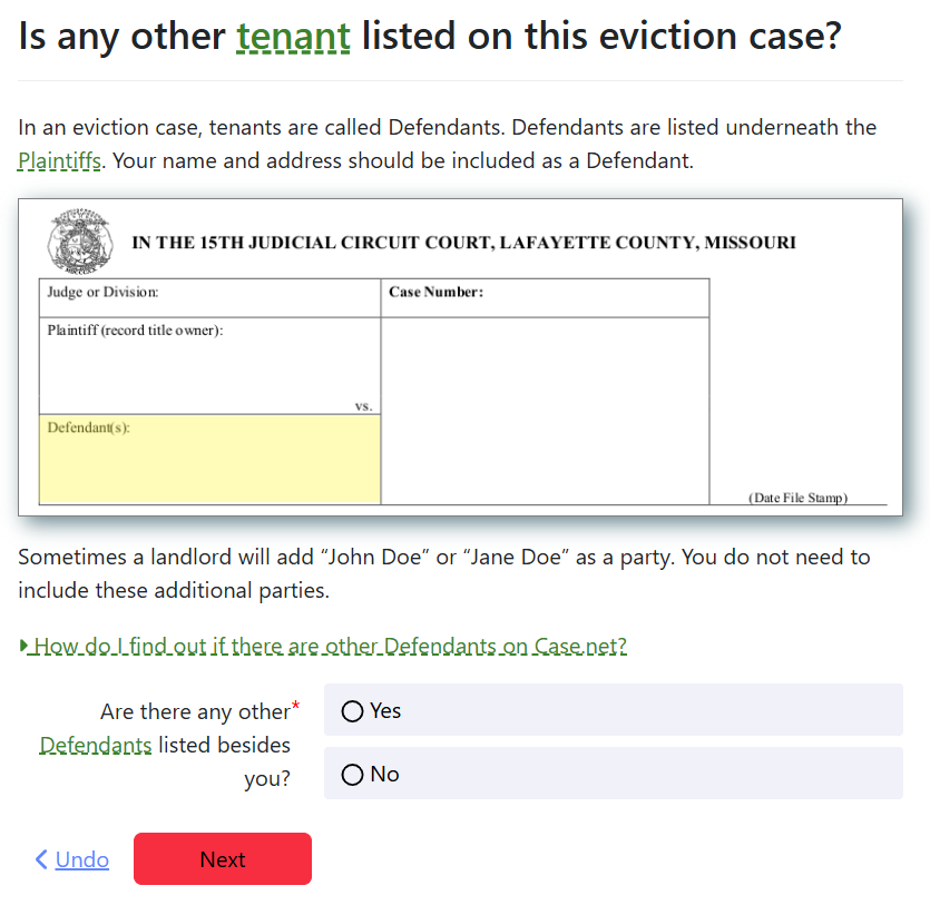
- use diagrams to help users locate information on paper forms
- make use of timelines, charts, and similar visual aids if needed to help a user understand a larger process
Example: a diagram of a form with the place that the tenant's information will appear highlighted.

Keep page content short and actionable
A guided interview is not an appropriate place to educate your user about the law. They came to your website with a specific mission: to complete a form. Link to a website with additional context if needed.
Use short, actionable text on screen wherever possible.
A rule of thumb is to have no more than 1-2 sentences of explanation on most screens along with the individual form fields. Many screens will not require any explanation.
Ask questions your user can answer
Questions with a limited number of choices are easier than open ended ones. Several short questions are easier to answer than 1 long question.
Do your best to allow your user to continue without:
- typing information from a document
- asking someone for information
- performing a calculation
At best, these questions will annoy and slow down your user. At worst, your user may give up when asked to get information that is not already in their head.
📺 First Wednesday Workshop: For detailed strategies on creating user-friendly interviews and accessibility best practices, watch our workshop on Guided interview user experience design best practices. This session covers question design, usability testing, and creating interviews that work well for all users.
Answer questions for your user when you can
For example, computers can very easily:
- figure out what day "today" is
- do math
- add and subtract dates to determine deadlines
- count items in a list
While a paper form may leave a blank space for the information listed above, your application should save your user from this effort.
Provide graceful "I do not know" options when possible
Paper forms are flexible in this way. If a form asks for a date, like a birthdate, the user can write in an estimate. Your interview should provide that flexibility. Show a date input. If the user may not know the date, provide a checkbox that allows the user to write in a longhand description of the date instead (e.g. 'last summer').
When you give the user a list of options that requires them to make a choice, give an "I do not know" choice among the options if you can. Make sure your form can deal with that uncertainty with an appropriate and safe default.
This is important any time that the information must be gathered, either from the user's home or by contacting a third party. It may not be possible for the user to get the information.
Does the defendant own any weapons?
- Yes
- No
- I don't know
Does the defendant own any weapons?
- Yes
- No
Show your user all of the information that they need to make the correct choice
Use the order of questions and the set of fields that is visible on the screen to guide your user to make correct choices. For example: if you ask your user to describe what happened, and then you have a follow-up question to describe how they were harmed by what happened, it would be annoying to your user to have already answered the "harm" question in the more general response and then have to re-write their response.
Use validation and helpful error messages
Use input validation to format fields that require formatted data with strict rules.
Use helpful error messages when users get information wrong.
But:
- do not apply validation to fields if there is a chance that your validation is too strict or that the validation rules may change.
Instead, you may just want to provide help text that suggests how the user should fill the field.
For example, allow space for the user to provide information like phone numbers and addresses that are from a different country.